More Cafe

OVERVIEW
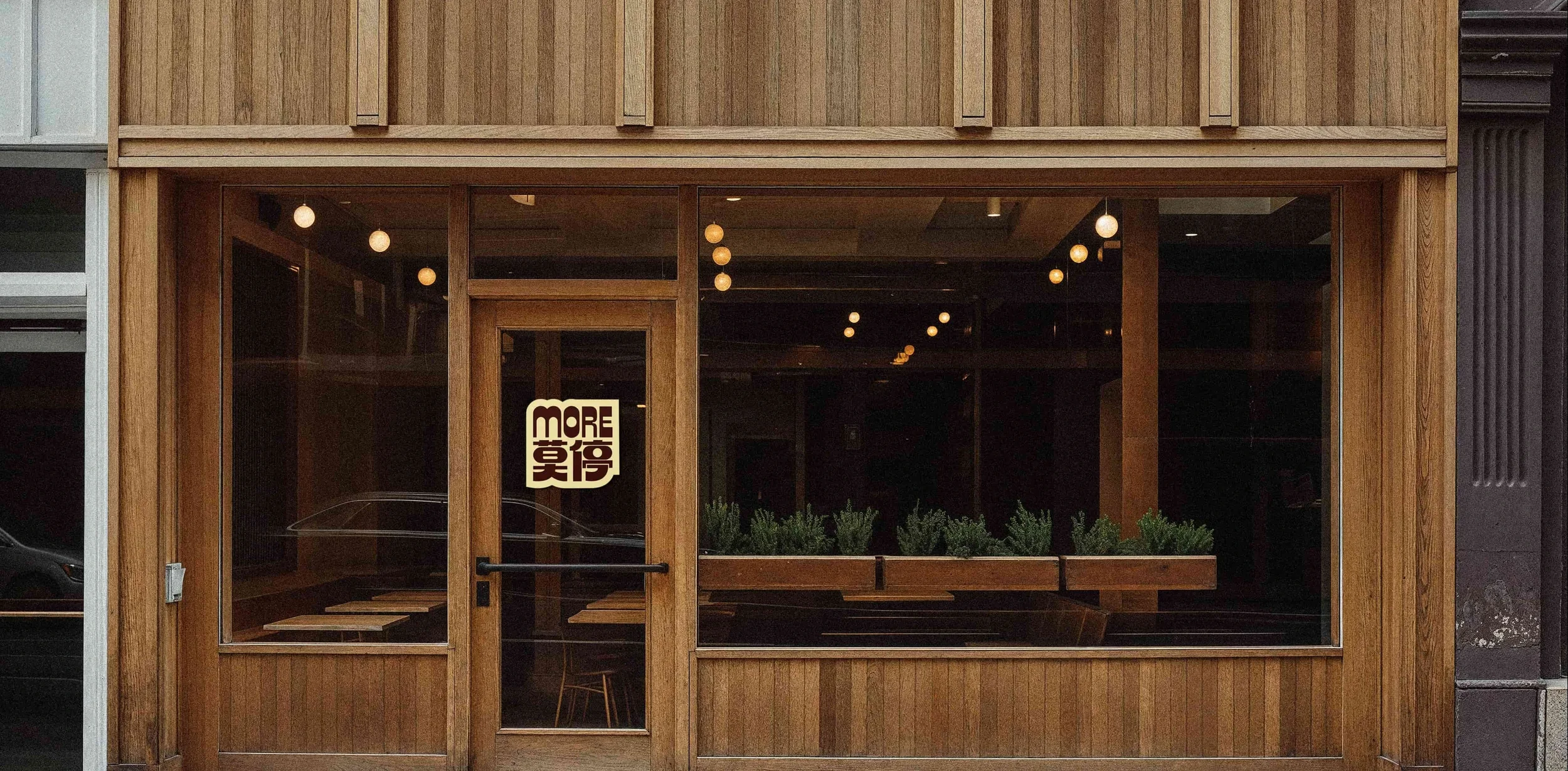
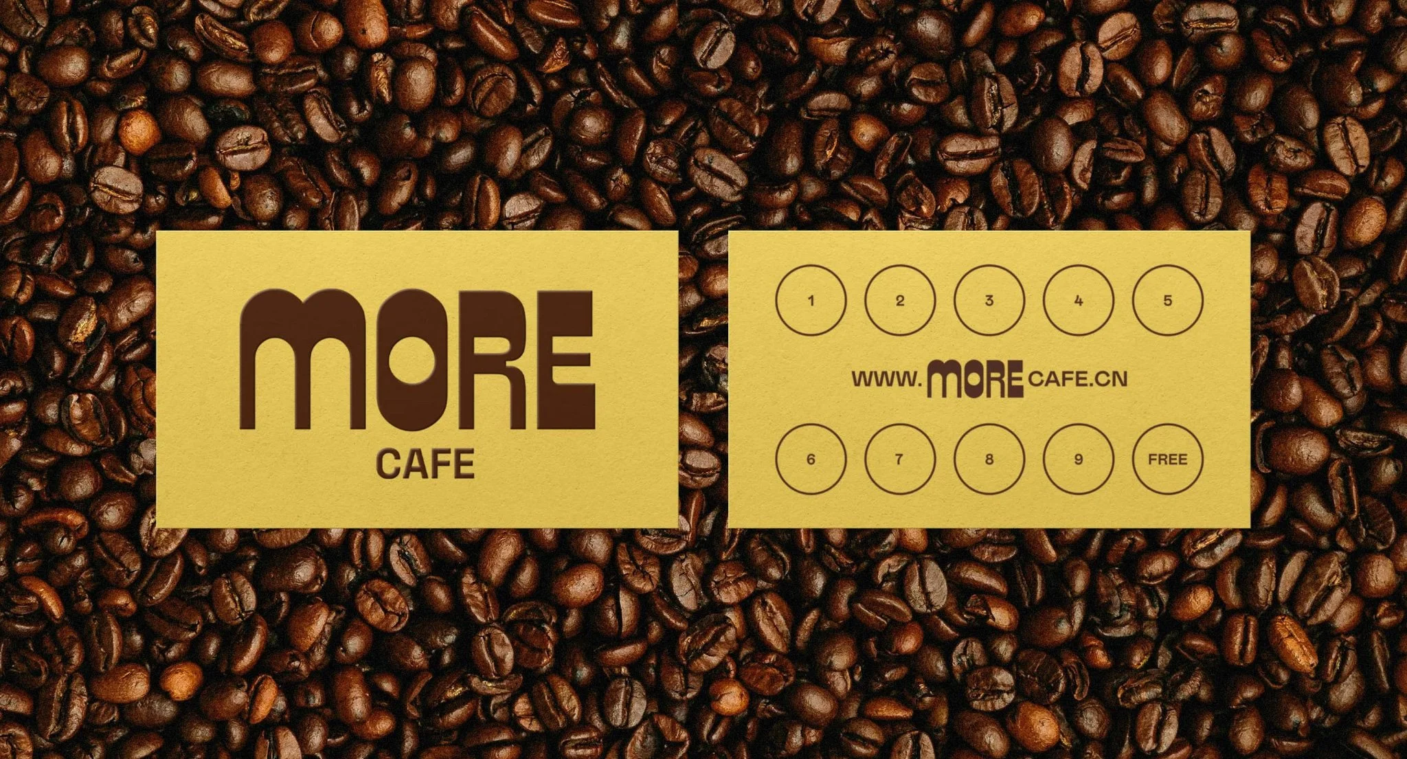
More Cafe is a Beijing-based coffee shop that came to me for one thing: a playful, bilingual logo that could live across cups, storefront signage, and business cards. I designed a wordmark pairing the English name "MORE" its Chinese name, built to hold up at any scale.

IMPACT
One flexible mark that carries the brand across physical touchpoints in two languages.
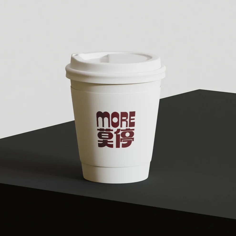
A disposable coffee cup with a white lid and a logo that reads 'MORE' above Chinese characters, placed on a black surface against a plain white background.
The storefront has large glass windows and a wooden exterior with a door in the middle. Inside, hanging light bulbs are visible, and there is a sign on the door that reads 'MORE' in English and Chinese.
A promotional flyer for More Cafe, featuring a background of roasted coffee beans, with two beige rectangles overlaying the beans. The left rectangle displays the cafe's name in large dark brown letters, and the right rectangle contains a series of numbered circles, a website URL, and a small text indicating a free item.